How to Assemble a Tool Kit to Create a Powerful Visual Identity
By Meg Fowler Tripp and Roger Sametz
August 1, 2017 | Read Time: 10 minutes
A well-crafted visual brand plays an important role in attracting, engaging, and sustaining a connection with participants, donors, and prospects and can help you save precious time and money.
Creating a visual brand today is like crafting a mosaic: Through the communications you control, you place verbal and visual “tiles” to develop a recognizable brand. But some of the tiles in your mosaic will inevitably be placed by those outside your organization — through others’ social-media channels, for example. You can’t control that, but you can provide a strong, clearly defined context for these outside contributions. Don’t miss the opportunity to create a mosaic that matters.
Ensuring that your materials reinforce one other is critical. To accomplish that, you need to develop approaches to type, color, imagery, and composition that provide the glue to connect seemingly disparate communications. Your website, planned-giving mailer, capital-campaign overview, annual-fund solicitation, and newsletter are all different items, but they must build on each other if you’re to get the most out of each element.
A shared visual vocabulary allows you to fine tune communications to specific audiences while always building recognition. For example, a planned-giving piece might use your typefaces and color palette more softly than an annual-fund piece directed toward young professionals.
Answer These 5 Questions
Your visual system needs to express who you are while also being the right handshake for your constituents. Get started by answering these questions:
1. What are your organization’s attributes and how is it distinct from other nonprofits?
What are the qualities and characteristics that define your institution, and how do they help you differentiate yourself from competitors and connect with constituents? Positive perceptions should be reinforced; negative perceptions should be acknowledged … and then managed.
2. What are your organization’s assets and capabilities?
What unique assets, physical or intellectual, does your nonprofit possess? For instance, a symphony orchestra has a venue, musicians, and a repertoire. Your design choices should capture and elevate the unique people, places, and personalities that draw people closer to your mission.
3. What are your audience’s expectations — and how far can, or should, you stray from them?
It makes sense that a research university would communicate differently than does a small liberal-arts college, but staying slavishly within those norms won’t help you stand apart. That said, if you go too far, you risk confusing or alienating your intended audience — or worse, looking like you’re trying to be something that isn’t achievable or believable.
4. What are your strategic goals?
What strategic goals does your visual expression need to advance? Are you trying to reach a wider or different pool of prospective donors? To be seen as part of a different peer group? Your approach to visual expression should focus on promoting your most critical aims.
5. What are your current visual conventions?
How are you using the elements of visual expression now? Are your current efforts advancing or obstructing how you want to be seen? Reinforcing or negating desired attributes? Answering this will tell you how much work is needed.
Elements of a Visual Tool Kit


Your visual tool kit combines elements you can own and elements you can’t. You can own your logo, but you can’t own typefaces unless you commission them. Similarly, you can own images you commission, but other elements are open source.
Ultimately, it’s the choices you make, how those choices are expressed, and the way they interact that yield a system that can look proprietary even when elements of it are not.
With this thinking in mind, it’s time to dig in and make choices.
The illustration above depicts the components that contribute to a nonprofit’s visual brand.
Logo/logotype: Separately or together, your logo or logotype (distinctive typographic treatment) are unique elements of your visual tool kit. They should clearly convey the personality and impact of your brand. While neither by itself is your visual brand, they need to be elements in which you can invest the desired meaning. And both need to work well across different formats and media and serve as a centerpiece for the rest of your design choices.
Project Bread’s identifier (see slideshow above for this and other examples) underscores its vision that the opposite of hungry isn’t just full — it’s healthy. The “scratched” type evokes stenciling on the side of a bushel of vegetables.
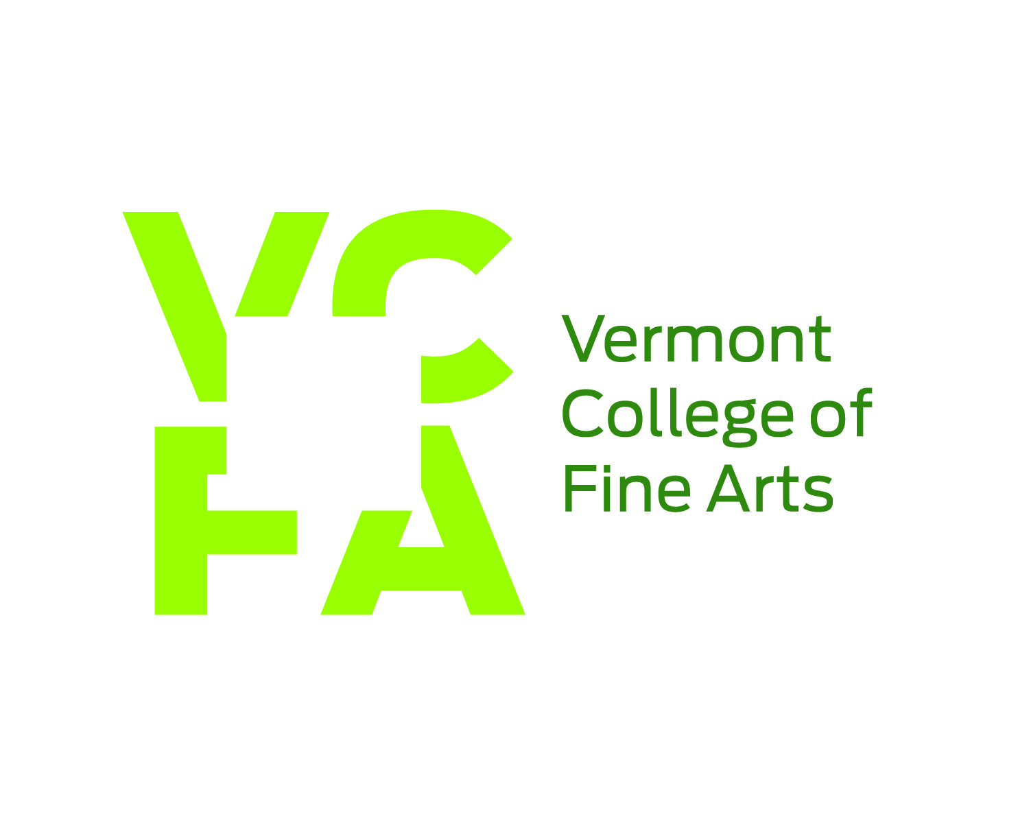
The logo of the Vermont College of Fine Arts incorporates a window — a view into one’s future career, perhaps, or into the possibilities of one’s art. The negative space invites the viewer to participate.
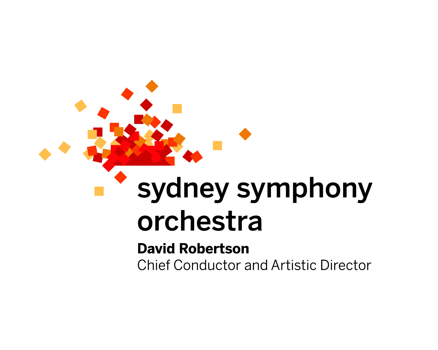
Australia’s pre-eminent symphony orchestra bucks orchestral conventions with its new mark. The symbol is the orchestra members; it’s the audience; it’s the range of offerings; it’s breaking free of norms; it’s enthusiasm.
Color: Consider the science of color theory, which explains how different colors in the spectrum affect mood and comprehension. In a nutshell, warm hues (yellows and reds) are dynamic and energetic; cool hues (blues and greens) are stable, calm, and reflective. Choose a palette of colors and use them consistently, with the understanding that you can fine-tune their use for specific audiences and opportunities.
Sarah Lawrence College’s capital-campaign casebook reinforces the institution’s historic color, while the short flap exposes the spring colors of the New York State campus.
The Seattle Symphony is innovative and very much of its city. The organization’s primary color is bright magenta, usually paired with charcoal and yellow.
Type: Your type choices need to tick a few boxes: readable; flexible across print and digital applications; compatible with any type featured in your logo or logotype (if not the same type); and, of course, reflective of your brand attributes. Often a combination of typefaces is what’s needed.
Olin College of Engineering is leading a transformation in engineering education. Its typefaces, displayed and articulated in its book of brand guidelines, are a unique combination that talks to engineer-innovators and donors who are interested in solving the world’s pressing problems.
Much as the Seattle Symphony surprises with its color palette, its three families of type are a very unusual, almost proprietary, combination. The classic Garamond speaks to preserving and performing the historic orchestral cannon; the Geometric Slabserif reflects the organization’s bold approach to everything; the Proxima Nova connects to new music and new approaches to being an orchestra.
Imagery: Every visual tool kit deserves a rich library of images that clearly convey what your organization does, whom it does it for, and the impact of its work. As you put your library together, remember that subject matter and execution are equally important. Sometimes you’ll want to position the camera as a participant; other times, you’ll want to record an activity from a distance.
Photography for the Sydney Symphony Orchestra is focused on who is making the music, the audience experience, and the orchestra’s signature venue. Different points of view provide variation within these categories. The shot of the musicians positions the camera as a participant.
Composition: Now it’s time to put it all together. The way you combine your identifier, type, color palette, imagery, and compositional approaches will differ across communications and channels, but working within your system is what will make these pieces distinctly yours. Your design efforts will evolve from being a hodgepodge of one-offs to a mosaic that stands up to, and stands out in, the increasingly complex communications environment.
Across a range of materials for supporters — an overview for major donors, quarterly newsletters, a program placemat at a yearly fundraising event, and the organization’s website — Project Bread’s communications use the same palette, typefaces, and gestures, but they are distinct and targeted by how the components of the design system are deployed.
The Best Tool Kit Is a Shared Tool Kit
Once you’ve configured the tool kit for your brand, it’s time to put it in the hands, computers, and mobile devices of all those charged with communicating on your behalf. Whether you create a book, an extranet site, or a less in-depth overview, take the time to train your team on the different aspects of your visual brand, including the thinking behind each of your choices. Be ready to answer questions, adapt to needs you might not have foreseen, and provide thoughtful feedback on first efforts.
Roger Sametz is the CEO and Meg Fowler Tripp is a principal and director of editorial strategy at Sametz Blackstone Associates, a brand-focused strategy, design, and digital-media agency in Boston.