October 12, 2006 | Read Time: 8 minutes
A children’s charity borrows a corporate tool to monitor its performance
Kate Becker, a vice president at Kaboom, a Washington charity, helps oversee her charity’s efforts to build hundreds of playgrounds and recreational spaces each year.
Helping her to manage and keep track of all those projects is a system that Kaboom has borrowed from the corporate world, known as a “dashboard.”
The performance-monitoring tool gives organizations a quick, one-shot view of their goals and how well they are meeting them.
The dashboard, accessible through Ms. Becker’s computer, is filled with colored graphs, charts, and tables that allow her access to both broad and detailed measures of Kaboom’s progress and efficiency. That data helps her make informed and timely management decisions, she says.
At the end of last year, for example, Ms. Becker decided to cut down the number of playground-building projects assigned to each of Kaboom’s project managers. Instead of each being asked to complete 18 building projects annually, the 16 managers now aim for about 14.
That move was prompted by indicators she followed on the dashboard: One told Ms. Becker that the turnover rate among the managers was rising, and another showed that fewer neighborhood volunteers were helping with the projects than the charity hoped.
She also saw that the managers had only six weeks, on average, to recruit volunteers and organize the building of a playground; the goal was 10 to 12 weeks.
Since the change, the average tenure among project managers has risen from 22 to 26 months, and the number of volunteer leaders involved in the building projects has grown by 8 percent.
“I don’t need a dashboard to tell me that staff turnover is important to look at,” Ms. Becker says. “What the dashboard does is give us a way to analyze all kinds of data at the same time, and see how workload was affecting our goals for more civic engagement.”
Serving Youngsters
The idea for Kaboom was born in 1995 when Darell Hammond and Dawn Hutchison, who both worked at charities that serve youngsters, read in the newspaper about two children in Washington who suffocated while playing in an abandoned car.
Inspired by the tragedy, Mr. Hammond and Ms. Hutchison raised corporate donations and recruited more than 500 volunteers to build a playground near where the children had died.
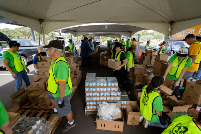
Since then, Kaboom has mobilized 200,000 volunteers to construct 5,000 playgrounds, ball fields, and skating rinks around the country. Most of the group’s expenses — it will spend about $20-million this year — are covered by businesses that sponsor building projects and give their employees opportunities to volunteer in Kaboom events.
Mr. Hammond set his sights on adopting an online measurement system for Kaboom five years ago.
He says that he was in a meeting with Robert L. Nardelli, chief executive officer of Home Depot, one of Kaboom’s biggest corporate sponsors, when he found that his attention kept drifting to the two computer screens on Mr. Nardelli’s desk.
The screens, filled with colored graphics, seemed to be buzzing with information, Mr. Hammond recalls. It turns out that he was looking at Home Depot’s new dashboard, and Mr. Hammond knew right away that he wanted one for Kaboom.
The charity had been growing fast, and Mr. Hammond says he wanted to stay close to both the details of the operation and its overall aims.
He also wanted to sort out and put to use the overwhelming amount of information piling up throughout the organization, such as reports on the playgrounds under construction, the number of volunteers it mobilized, and how much it was spending. And he wanted everyone at Kaboom to understand the organization’s mission and how the group was trying to fulfill it
By the end of 2004, the organization had developed the “Kaboom Formula,” its own version of a dashboard. It is among a growing number of nonprofit groups using such systems.
Dashboards are just one piece of the growing efforts by companies and charities to measure performance and set benchmarks so they can improve their efficiency, bolster the bottom line, or measure how many people they are serving and how well.
“People on charity boards come from the business world, where they are used to the dashboard idea,” says Katie Delahaye Paine, a consultant in Durham, N.H., who specializes in measuring the performance of nonprofit groups. “They are saying, ‘We want measures of success at our charities. We want to see dashboards.’”
Meaningful Data Is Key
Dashboards do not have one standard approach.
At the Dana-Farber Cancer Institute, in Boston, for instance, a constantly updated dashboard on an internal Web site looks like a notebook, with tabs pointing viewers to 180 pieces of information that can be used to monitor the finances, fund raising, patient care, and other operations of the $600-million cancer hospital and research institute.
Miriam’s Kitchen, a much smaller Washington group that serves homeless people, created a “management dashboard” with about two dozen sets of statistics that its executive director and the governing board review monthly.
Whatever the details of the system, the key factor is what kind of data is collected and how it is used, says Jason Saul, author of Benchmarking for Nonprofits: How to Measure, Manage, and Improve Performance.
“A dashboard could just be a fancy report that says nothing if the data isn’t meaningful,” Mr. Saul says. “It’s easy to create a database and plug in numbers. It’s much harder to create performetrics that can be measured against key outcomes and used to make real-time programmatic, financial, or managerial decisions.”
At Kaboom, Mr. Hammond, along with members of the board and key employees, started their process not with the numbers but by honing the organization’s mission statement. Then it set long-term goals and strategies, and decided which aspects of the organization’s operations to measure so see if the group was making progress toward its objectives.
Because the charity gets most of its money from company sponsors, “we didn’t have pressures from funders to measure certain things or prove certain things,” unlike many charities that are closely evaluated by grant makers, Mr. Hammond says.
Little of Kaboom’s support, he notes, comes from foundations or individuals. “So we decided that we would focus on a system that would help us improve our own performance, and not mess with trying to prove the downstream social impact, like whether playgrounds lead to less childhood obesity,” he says.
He adds: “We wanted the dashboard to be a tool to help us stay on course toward the social change we want to effect — healthier kids, more civic engagement — not be the barometer of that social change. If we do our job right and efficiently, that will come.”
After Kaboom leaders determined that their dashboard system would measure internal performance, they decided to include about 15 statistics on the main dashboard, including number of play spaces built each year, average number of volunteers per play space, and how much it costs to produce $1 in revenue.
Another two dozen or so other figures lie beneath the main measurements, breaking down, for example, the number of playgrounds that were built as a result of volunteers attending a Kaboom training session or using its online planning tools.
Kaboom employees can customize their dashboards so they will have the data most relevant to their jobs at their fingertips.
Measuring the Mission
But even with the vast amount of data now ricocheting throughout the organization, the performance-measurement system is not all about the numbers, Kaboom officials say. It also serves as a rallying point, focusing staff on organizationwide priorities like promoting civic engagement.
“The effect of working toward a common goal in the best, most- efficient way possible has seeped into the fabric of the organization,” says Tony Deifell, who oversees the charity’s strategy.
Michael Sands, a Kaboom board member, says, “If you’re in accounting, looking at cash balances all day long, the dashboard can show you where your cash position fits in the big picture.”
Anyone looking at the dashboard, though, must be careful to analyze the data carefully, he says, and avoid snap judgments based on fluctuations in the data. At Kaboom, some figures appear in red when they fall below the organization’s goal, he notes.
“You see a red box, think something has gone wrong, and start looking for a quick fix,” Mr. Sands says. “Instead, what you should do is start asking questions.”
The need for that kind of caution became evident when Kaboom officials noticed that one of the key dashboard indicators, the proportion of playgrounds built in neighborhoods filled with needy families, had dropped well below its goal of about 80 percent.
After examining the data, charity officials saw that a project to build playgrounds at 25 day-care centers in and around Atlanta was skewing the figure, which is based on the average income in neighborhoods where play spaces are built. Those day-care centers served many children from low-income families, even though they were in or near affluent parts of the city and its suburbs.
Mr. Hammond, who says he usually takes a daily look at the dashboard, says the next step is to use it to share information with potential donors.
Kaboom will soon start trying to raise money from foundations, he says, to help pay for a new effort to encourage neighborhood leaders, parents, politicians, and others to approach their municipal governments, school boards, and other entities to advocate for more play spaces for kids.
“We’ll be taking it on the road,” Mr. Hammond says of the performance-monitoring tool, “using it to tell about what good we are doing. The answers are all there.”