January 4, 2012 | Read Time: 2 minutes
When the There Is No Limit Foundation had the chance to work with a professional design company to create a graphic to help explain its programs, it was faced with an important choice.
The organization, which was started in 2008 to fight global poverty, gender inequality, and diseases, could use the graphic to try to explain the breadth of its work or to focus on a single issue it tries to solve.
“Since the foundation and its work is unknown to many people, an infographic describing a problem they address and the work they do seemed to make the most sense,” says Matthew Sharpnick, chief strategy officer at Elefint Designs, in San Francisco, which donated its services to the There Is No Limit Foundation through a contest co-sponsored by The Chronicle.
The result was a graphic that points out some of the problems facing Guinea—a small nation that doesn’t typically get much attention in the United States—to help introduce the charity and its work in poor countries. The graphic also includes information about the group’s programs to fight poverty in other countries.
“Guinea is a country most people have never heard of,” says Aissata Camara, the nonprofit’s vice president and co-founder. “The infographic will help us in our quest to raise awareness about the issues Guineans face daily.”
The graphic, which the nonprofit is promoting on its Web site and publications and offering to other nonprofits and supporters, uses basic data about conditions in Guinea to spotlight the nation’s challenges.
See the graphic below with explanations of some of the key elements of the There Is No Limit Foundation’s graphic.
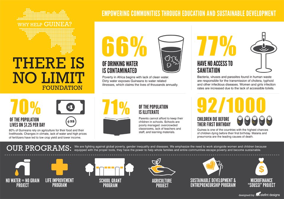
1. Emphasize key numbers
Instead of using charts or graphs to convey information, the graphic uses big, single numbers to draw a reader’s eye and spotlight some of the key problems facing Guinea, such as poor water quality, which the charity is working to improve.
2. Choose relevant images
Simple icons—for example, showing currency—help illustrate the data.
3. Explain the data
Each piece of data is paired with two sentences to supply context.
4. Offer more
The graphic contains a section that introduces six of the foundation’s key programs in other countries.